Why Mobile Experiences in E-Commerce are Important
 Ryan Kodzik
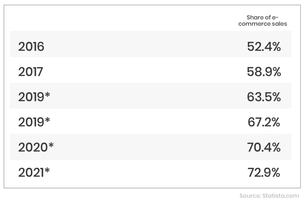
Every year, the statistics and numbers for eCommerce mobile experiences continue to rise.
According to Statista:
- There are significantly more users accessing the web from their smartphone or tablet than a desktop now than ever before.
- Percentages show that mobile usage has risen from 52.4% in 2016 to 67.2% in 2019.
- These statistics also predict that by 2021, the usage will have skyrocketed to 72.9%.
This means that if you’re planning on running a successful eCommerce business in 2019 and beyond; you’re going to have to cater to the mobile users out there.
Mobile traffic has long surpassed desktop e-commerce traffic, and this number is continuing to rise with no signs of slowing down. If these statistics aren’t enough to convince you then it’s time to get into why mobile experiences are important within eCommerce and how you can improve yours.
What does a Good Mobile Experience Look Like?
Before we get into the benefits of having a mobile-friendly e-commerce store and how to improve it for your customer. We must first look at what a good mobile experience looks like.
Establishing an experience that is great for everyone is difficult. Since we have experience working with top brands, we’re sure we can tell you all you need to know.
A good mobile experience will look sleek, run smoothly, and should have everything in the correct order. You don’t want anything out of place on your mobile site. If it’s a customers first impression and it doesn’t look top-notch; they’re going to be disappointed in your brand and business. First impressions do matter when a customer visits your site for the first time. They want their experience to be a good one.
Think of it like this; the website should look as if it was built purely for mobile. It could be that your desktop version never existed, but your mobile viewers will never know any different.

What are the Benefits of Mobile-Friendly eCommerce?
Improved SEO rankings – Google and other search engines rate the websites with a better mobile experience as higher on their rankings when people are searching. In 2018, Google released a statement explaining that the sites that are configured for mobile and had a responsive design were preferred by Google’s recommended design pattern meaning the rankings for SEO would be better. If a site passes their mobile-friendly tests, then this would ultimately improve the sites ranking.
Better conversion rate – Having an optimized mobile site ensures that the users can still purchase from the site even if they are viewing from their handheld device. While the conversion rates for mobile are lower than desktop, giving your customer the ability to purchase from their smartphone if they wish means you are more likely to get a better conversion rate. According to Monetate’s eCommerce study in 2017, 2.03% of mobile users convert with 4.19% of tablet users converting too. Another survey also revealed that 67% of customers are more likely to buy from a website that is mobile-friendly.
Better customer satisfaction – If customers enjoy shopping and browsing on your site then they may come back or rate you as a good business to buy from. Statistics from GoDaddy show that one of the best ways to retain customers with mobile is to have a responsive and mobile-friendly website.
What to Improve to Have a Better Mobile Experience?
Responsive or Adaptive Design – Having a responsive design on your website means that it will adapt to the user’s behavior and environment depending on what screen size and platform they’re using is important. The automatic responsiveness means you don’t have to worry about where your traffic is viewing your site from. You can simply sit back and enjoy the sales.
Navigation – Since smartphones are a lot smaller than desktops, the navigation on your website has to be a lot simpler. You don’t want your customers confused with the buttons or overall navigation of your site which means everything has to be perfectly optimized. Improving the navigation on your website, so it’s easier for the customer is sure to better the mobile experience, even if you don’t improve anything else.
Product Presentation – It’s recommended that as an eCommerce business you present your products in an easily viewable basis on a mobile device, this has two main benefits; your products are clearer to see for the browsing customer, and also it reduces the loading times of your website.
Smart Search – Having a fully optimized and responsive smart search means your customer isn’t pinching and zooming on your site which can be annoying. Smart search allows the customer to search for products on your website without the regular hassle and it’s more likely that they’re then going to buy something too.
High-Quality Photos – According to Shopify, quality product images are a key driver of store engagement, conversion and retention, and overall customer lifetime value. If that isn’t enough to convince you that high-quality eCommerce images are a good idea. We aren’t sure what to tell you!
Why Is It Important?
Increased customer potential – With more people browsing on mobile devices than desktop, having a mobile-friendly website opens a world for your customer potential. More people will see your website meaning you’re going to get more customers. Thus, more sales as an eCommerce business.
It’s 2019 – It’s time to get with the modern age which means having a mobile-friendly website. As technology continues to grow, more businesses need to improve their mobile experience. Especially if they want to be valued in the world of e-commerce.
It’s the future – Mobile usage continues to rise every year, and with the predictions of mobile eCommerce sales reaching an all-time high in 2021, it’s in your best interest as a business owner to keep up with the industry. After all, it will ultimately benefit you and your growing eCommerce company.

In Conclusion
If we haven’t already convinced you that having a mobile-friendly website is the way forward. All you have to do is read the statistics. There isn’t one agency or technology company out there that will advise you against being responsive. It’s a daunting and scary process advancing with the technological age, but it’s always in your best interest.
Ready to put this into practice?
We build and grow Shopify stores for DTC brands, from store design and development to Klaviyo and full-scale CRO programs. If you want to talk through what this looks like for your store, book a call. No pitch, just a conversation.
Book a discovery callRelated Articles