Why Your Site Should be Accessible and What You Need to Do
As a business owner, excluding valuable customers from your product or service is probably the very last thing you want. Sure. You have a target audience and a buyer’s journey. And you’re probably segmenting ads and delivering content to the right people at the right place and time. But those are just marketing strategies. The truth is, you want as many customers as possible. So, how unnerving would it be if you were accidentally pushing away 1/4th of Americans?
Over 25% of US adults live with a disability or disabilities. At the same time, less than 10% of websites follow the Web Content Accessibility Guidelines (WCAG) set forth by the World Wide Web Consortium (W3C). So, while eCommerce brands continue to pour significant resources into digital marketing (up to 54% of total marketing budget according to CMO), many are failing to make their website accessible to the audience they’re spending time and money capturing.
While website accessibility may not be a lead magnet, it can certainly create revenue leakage. Here’s why businesses should focus on website accessibility in 2020, and how a few simple website changes can help invigorate your 2020 goals.
Understanding Website Accessibility
Website accessibility starts and ends with the Web Content Accessibility Guidelines (WCAG). These accessibility standards are maintained by The World Wide Web Consortium (a global web standards organization) and endorsed by almost every government on the planet. While WCAG has been the de facto guideline for years now, this status was cemented in the US when a United States District Court in Florida ruled that the WCAG guidelines are the primary industry standard for web accessibility.
To clarify the importance of these guidelines, that same court case ended with winndixie.com (the commerce store for a supermarket chain) being ruled in violation of the Americans With Disabilities Act due to not following WCAG guidelines and therefore making their website difficult to browse for the visually impaired.
This brings up an important issue. Failing to follow WCAG guidelines opens your business up to lawsuits. In fact, you can be sued for discrimination in both the US and UK for failing to implement WCAG standards on your website. Of course, that’s not the most significant financial risk you face. Beyond branding damage, website accessibility can turn away up to 25% of your audience. That’s obviously a big deal.
8 Ways to Make Your Website More Accessible
We know that having an accessible website is crucial if you want to reach a wider audience. But how do you do it? Here are 8 tips to help you get started on your web accessibility journey.

1. Use The Appropriate Headings
Over 50% of marketers say that blog content is one of their top priorities. Blogs are a great way to provide valuable information to consumers that help push them through your funnel at various stages of the buyer’s journey. But what happens when they have difficulty reading those blog posts you’ve worked so hard to create?
Globally, there are over 250 million visually impaired individuals. That doesn’t even include vision-related disabilities like dyslexia (43.5 million Americans have dyslexia) that can make navigating content difficult. H1, H2, H3, and H4 headers help break up content in an easily digestible way.
Simply creating consistent, accurate headers goes a long way towards making your content more approachable. Plus, smart header strategies help capture the attention of the 43% of people who skim your content. It’s a win-win.
2. Make Things Keyboard Accessible
While most people browse your website with a mouse, those who suffer from motor disabilities may not be able to glide their mouse and click to get to the next screen. The easiest way to enable those with motor disabilities is to make your website browseable by a keyboard. According to WebAIM, the majority of people who browse via keyboard use the tab key to navigate sites. They press tab to go from one element (e.g., link, button, etc.) to the next.
Not only should you organize your user interface so that tabbing to each new element is natural, but you should include code that visibly highlights each area that their keyboard is currently tabbed on. It’s also important that you keep your navigation as simple as possible since many people with motor disabilities are going to have difficulty navigating a lengthy navbar with the tab key. Of course, you should be keeping your navigation simple for other reasons. Cision recommends creating navigation using the KISS (Keep it Simple, Stupid) principle due to declining attention spans.
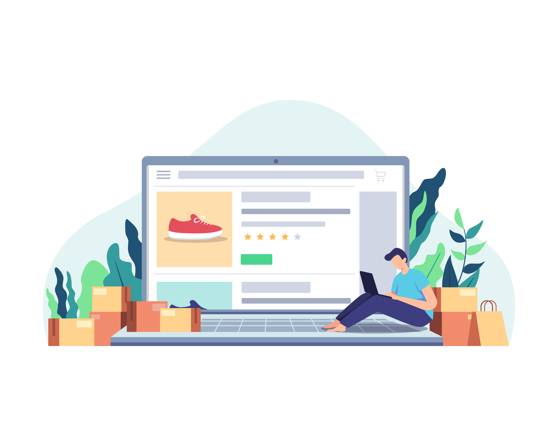
3. Add Alt Text to Images
Whether you use Shopify or WordPress, you’ve probably noticed a field for “alternative text” when you upload a photo. This is an alt text. You describe the image in this field, and it will display that text if the image fails to load. That way, people can get the gist of what you’re trying to show them. When people with disabilities use screen readers, they may automatically display this alt text.
This means that alt text is valuable both for cases where your image fails to load and for those with visual impairments. To top it off, alt text boosts your SEO. Make sure to include an alt text field on each image you upload.
4. Choose the Right Colors
While brand image certainly plays a role in the colors you choose for your website, you should also consider color blindness. There’s a ton of misinformation floating around about color blindness. While popular examples like “The Dress” may serve to showcase the difference in how we perceive colors, color blindness is incredibly complicated.
So, how do you avoid all of that complexity? You use contrast. Make sure that your light text is displayed against a dark background. The more contrast you create, the easier it will be for everyone to see your content.
5. Add an Option for Resizable Text
There are obvious benefits to adding a resizable text option to your website. Over 2 billion people have presbyopia and require reading glasses. A word of caution here. You have to make sure that each resizeable font doesn’t break your design. Sometimes, web owners plop an option for resizable text without testing each size out first. Make sure that none of the sizes create poor spacing or disrupt design elements. You want to keep your branding intact (branding consistently across channels can boost revenue by 23%) when font sizes are manipulated.
6. Make Forms More Accessible
Every website owner should strive to have intuitive, well-designed forms. Not only will well-organized forms help everyone who visits your website, but they’re particularly helpful for those who use screen readers or keyboard navigation. Since some people with disabilities will browse via the tab button on their keyboard, having forms with a logical, tab-friendly flow will go a long way towards accommodating these people.
Around 50% of marketers claim that online forms are their highest website lead generation tool. Why let valuable leads slip through the cracks with complicated, over-designed forms?
7. Create Text Equivalents
We already discussed alt tags for images, so what else is there? You should provide text equivalents for everything. If you do a podcast, put a transcription of the show notes in your blog. If you host a live webinar, feed text translation below it. Individuals with screen readers require text to comprehend and digest your content.
8. Hyperfocus on Your User Interface
Let’s get a little vague. Your user interface is the fuel that drives your website forward. It’s the glue that helps build sticky brands. But it can also be the barrier that prevents your website from being truly accessible. Every element of your UI should be tailored towards accessibility, aesthetics, and ease-of-use. This is tricky. You don’t want to focus solely on accessibility, or you risk alienating your core group by creating a run-of-the-mill, bland UI. At the same time, you want your branded, beautiful UI to be accessible to those with disabilities. It’s a dual-sided sword.
This is where having a savvy design agency comes in handy. Your UI is a work of art, and you want it to be handcrafted to fit all of your needs while representing your brand and aesthetic ideas.
Recommended reading What is conversion rate optimization?.
Are You Looking for An Accessible Website?
Don’t alienate over a quarter of your audience. Smart eCommerce brands build accessibility into the skeleton of their website. Are you looking to create an accessible website without sacrificing aesthetics, usability, and functionality? Contact us We’ll help you build your dream website so you can focus on what matters most — growing your brand.
Related Articles